I’m currently reading Exploring Requirements: Quality Before Design by Donald Gause and Gerald Weinberg. The book was written twenty years ago but it is still spot-on, which is really incredible for a software-development related book. Gause and Weinberg described an experiment from one of their workshops that was supposed to show how even the simplest things can cause a lot of misunderstanding. I honestly could not believe the results, so I decided to repeat it yesterday. The outcome absolutely amazed me.
They conducted the experiment by showing a seven-point star picture before one of their seminars, then after a lecture and a coffee break asked the attendees to tell them how many points the picture had. They got quite a wide spread of results. According to Gause and Weinberg, everyone knows what a five-point star looks like but seven-point star was not that usual, so people remembered it differently and recalled different images, especially after the coffee break. That accounted for the spread. People also understood the task differently, which explained clusters in the answers.

I am not so interested in people not remembering things off the top of their head, but I wanted to check the problem of differences in understanding. After my talk on Selenium yesterday, I handed out index cards and put a picture of a standard five-point star on the projector, asking people to write down how many points they see in the picture there and then. I used an image of a familiar figure (the one on the right) and it was on display while people wrote down their answers. So any differences in answers could only be caused by people understanding the task differently.
After initial reluctance and my explaining that the question might sound stupid and obvious, but I’d really like people to answer it anyway, I got about 50 cards back. And the results were simply amazing. I expected that most people would write 10 as the number, and that a few would possibly write “infinite” referring to the mathematical axioms that any line contains an infinite number of points. But the answers were much more surprising.
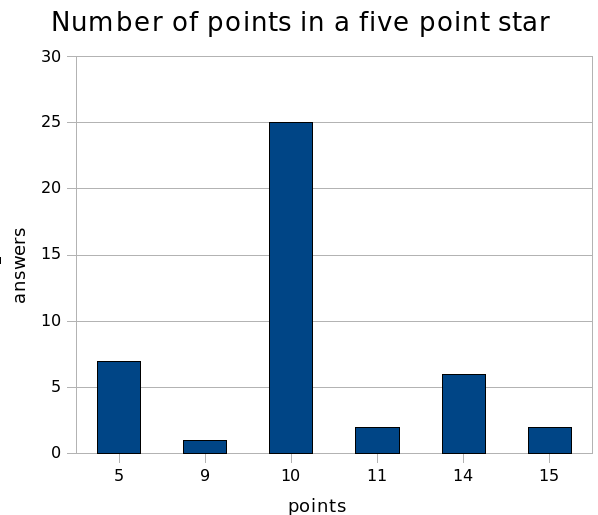
Most people (25) voted for 10 points in the star, counting inner and outer points. The second most popular answer (7) was five points, where people counted just the outer points. Number 14 got a lot of votes as well — one of the people at the pub after the talk explained to me that this is probably the ten points on the star and four corners of the picture. There was a single vote for number 9, which can theoretically be explained by five outer points and four corners of the picture, but there were also four cards which I can not explain at all: numbers 11 and 15 got two votes each.
If anything, this experiment has confirmed that even a simple thing as a familiar image and a straight-forward question can cause a lot of misunderstanding, or rather differences in understanding. Some people thought that the edges of the image counted as part of the image, some did not consider them. Some people just counted outer points, some counter inner as well. This is essentially why giving people screenshots or wireframes with simple descriptions does not work as an effective technique to pass knowledge. This is a very effective demonstration why we need workshops that stimulate discussion to define requirements and specifications, ideally using realistic examples which could then be converted to acceptance tests.