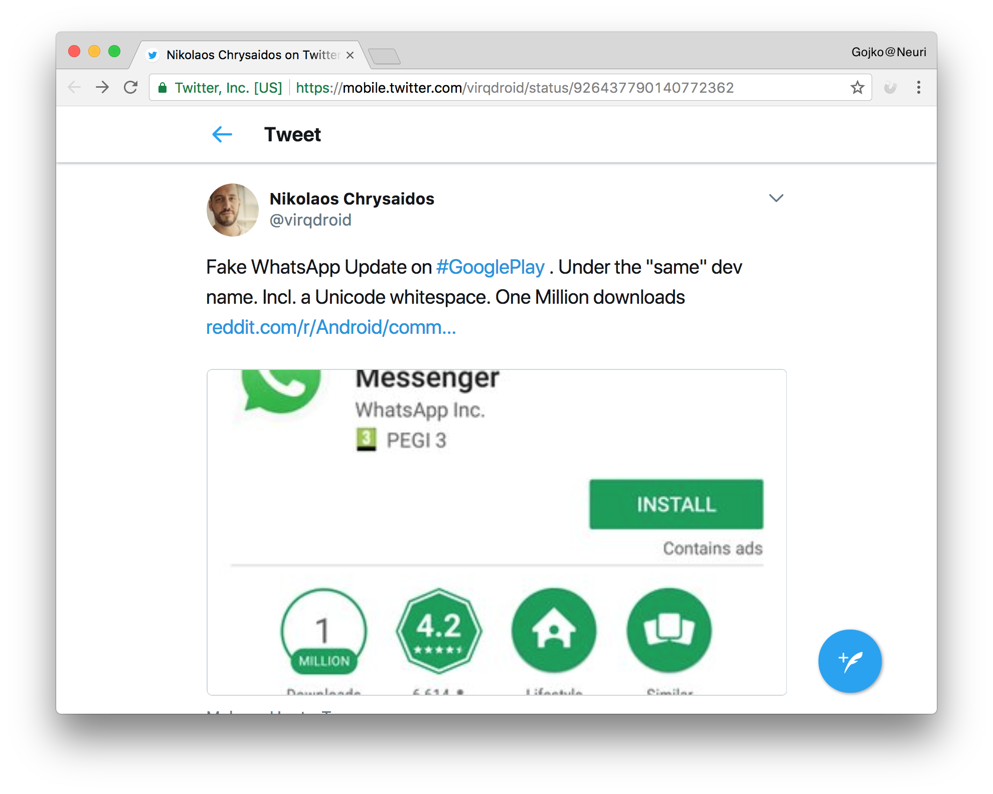
Last weekend, news emerged about a fake WhatsApp Android application, offered seemingly under the same developer name as the official application. The scammers were able to avoid validation by including a unicode non-printable space in the developer name. The hack fooled more than a million people before the Play store maintainers noticed it.

Unicode is an incredibly valuable standard, enabling computers, smartphones and watches to display the same message in the same way, all over the world. Unfortunately, its complexity makes it a gold mine for scammers and pranksters. If giants such as Google can’t defend against basic problems caused by Unicode, for smaller companies this might look like a losing battle. However, most of those problems revolve around a few exploits. Here are the top five things all developers need to know about Unicode to prevent scams.
1. Many Unicode points are not visible
Unicode has several zero-width code points, for example the zero-width joiner (U+200D) and the zero-width non-joiner (U+200C), which are hints for hyphenation tools. They have no visible effect on screen appearance, but they still affect string comparison, which is why the WhatApp scammers were able to pass undetected for so long. Most of these characters are in the general punctuation block (from U+2000 to U+206F). There’s generally no justification for allowing anyone to use code points from that block in identifiers, so they are least easy to filter. However, there are some other special codes outside that range that are invisible, such as the Mongolian Vowel Separator (U+180E).
In general, it’s dangerous to do simple string comparisons for uniqueness constraints with Unicode. A potential workaround is to limit the character sets allowed for identifiers and any other pieces of data which could be abused by scammers. Unfortunately, that’s not a full solution to the problem.
2. Many code points look very similar
Trying to cover all the symbols used by all the written languages in the world, Unicode necessarily has many similarly looking characters, to the point where humans cannot tell them apart, but computers have no trouble spotting the difference. An amazing abuse of this problem is Mimic, a fun utility that replaces common symbols used in software development, such as colons and semi-colons, with similarly-looking Unicode characters. It can create chaos in code compilation tools, leaving developers confused.

The problems with similarly looking symbols go far beyond simple pranks. Fancifully called homomorphic attacks, these exploits can cause serious security issues. In April 2017, a security researcher was able to register a domain that looked very similar to apple.com and even get a SSL certificate for it, by mixing letters from different character sets. All the major browser happily displayed the SSL padlock and listed the domain as secure.
Similar to mixing visible and non-visible characters, there’s rarely any justification for allowing mixed character set names to be used in identifiers, especially domain names. Most browsers have taken steps to penalise mixed-character-set domain names by displaying them as hex unicode values, so users do not get confused so easily. If you’re displaying identifiers to users, for example in search results, consider some similar way of preventing confusion. However, that’s not a perfect solution as well. Some domain names, such as sap.com or chase.com can easily be constructed completely out of a single block in a non-latin character set.
The Unicode consortium publishes a list of easily confusable characters, which might be a nice reference to automatically check for potential scams. On the other hand, if you’re looking for a quick way to create confusion, check out Shapecatcher - a wonderful tool that lists Unicode symbols visually similar to a drawing.
3. Normalisation isn’t that normal
Normalisation is very important for identifiers, such as usernames, to help people enter values in different ways but process them consistently. One common way of normalising identifiers is to transform everything into lowercase, making sure that JamesBond is the same as jamesbond.
With so many similar characters and overlapping sets, different languages or unicode processing libraries might apply different normalisation strategies, potentially opening security risks if normalisation is done in several places. In short, don’t assume that lowercase transformations work the same in different parts of your application. Mikael Goldmann from Spotify wrote up a nice incident analysis about this issue in 2013, after one of their users discovered a way to hijack accounts. Attackers could register unicode variants of other people’s usernames (such as ᴮᴵᴳᴮᴵᴿᴰ), which would be translated to the same canonical account name (bigbird). Different layers of the application normalised the word differently, allowing people to register spoof accounts but reset the password of the target account.
4. There is no relationship between screen display length and memory size
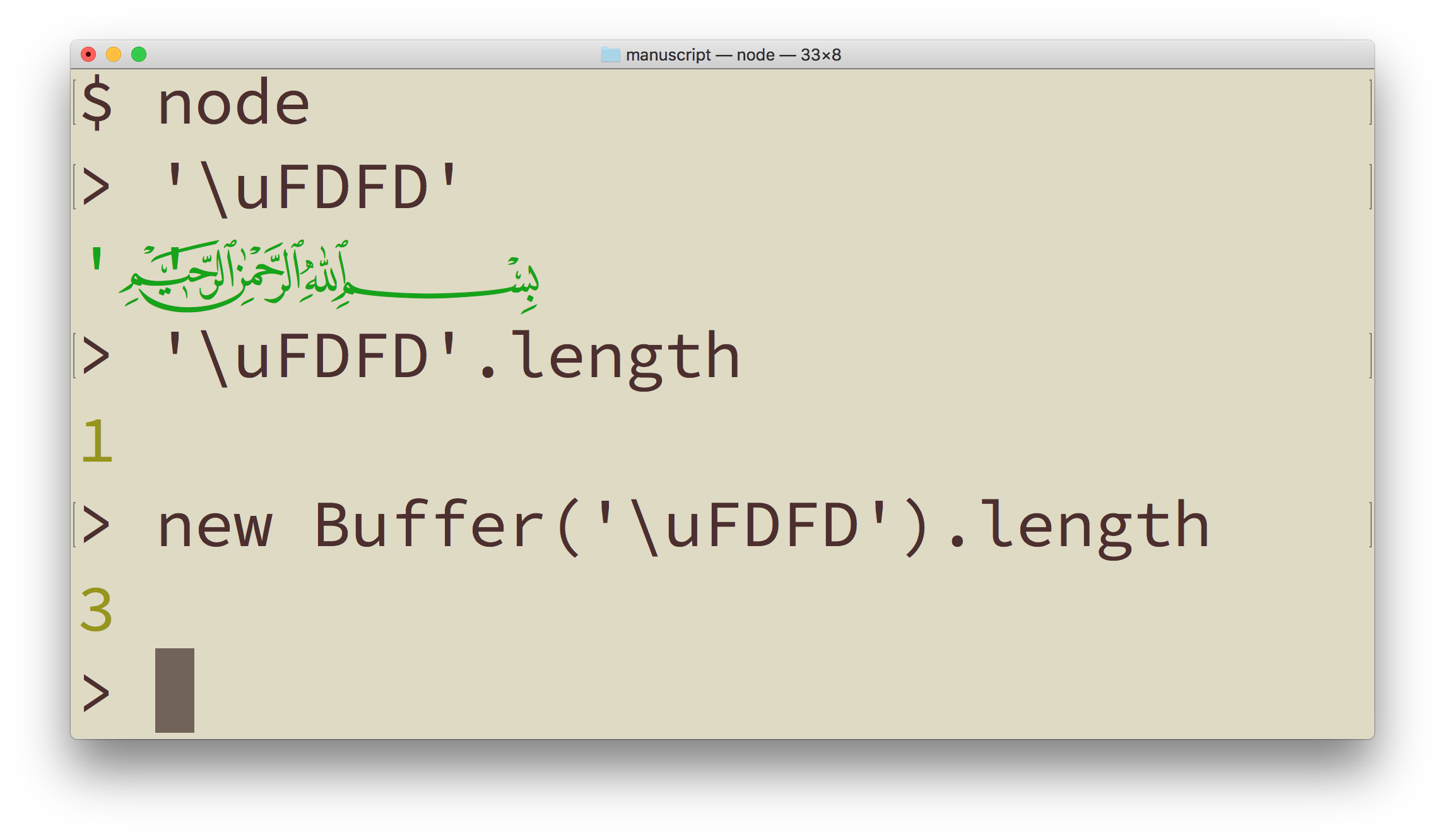
With basic latin and most European character sets, the space of a piece of text on the screen or paper is roughly proportional to the number of symbols and roughly proportional to the memory size of the text. That’s why EMs and ENs are popular units of length. With Unicode, any kind of assumptions like that become dangerous. There are lovely symbols such as Bismallah Ar-Rahman Ar-Raheem (U+FDFD), a single character longer than most English words, easily breaking out of assumed visual enclosures in web sites. This means that any kind of word-wrapping or text-break algorithms based on string character length can easily get fooled. Most terminal programs expect fixed-width fonts, so show it in one of those, and you’ll see the closing quote marks completely in the wrong place.

A nice abuse of this is the zalgo text generator, that adds surrounding rubbish around a piece of text, making stuff take up much more space vertically.
Of course, the whole issue of invisible code points makes the relationship of memory size to screen length irrelevant, so things that fit nicely into an input field might be long enough to blow up a database field. Filtering non-visual characters to prevent problems is not enough, as there are plenty of other examples that do not take up their own space.
Combining latin characters (such as U+036B and U+036C) take space above a preceding letter, so you can write multiple lines of text in a single text row (‘N\u036BO\u036C’ produces NͫOͬ). Cantillation marks, used to signal intonation for ritual chanting of scriptures from the Hebrew Bible can stack up indefinitely in the same visual space, which means they can be easily abused to encode a lot of information into something that takes up a single character on the screen. Martin Kleppe encoded the implementation of Conway’s Game of Life for browsers in cantillation marks. Check out the source code of the page for a nice shock.
5. Unicode is more than just passive data
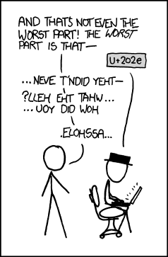
Some code points are designed to impact how the printable characters get displayed, meaning that users can copy and paste more than just data — they can enter processing instructions as well. A common prank is to switch text direction using the right-to-left override (U+202E). For example, make Google Maps look for Ninjas. The query string actually flips the direction of the search word, and though the page displays ‘ninjas’ in the search field, it actually searched for ‘sajnin’.
This exploit was so popular that even made it into XKCD.
 .
.
Mixing data and processing instructions — effectively executable code — is never a good idea, especially if users can enter it directly. This is a big issue for any user input that gets included in the page display. Most web developers will know to sanitise user input by removing HTML tags, but Unicode control characters in the input also need attention. This is a trivial way to work around any kind of profanity or content filtering — just flip the word backwards, and include a right-to-left override at the start.
Right-to-left hack might not be able to embed malicious code, but it can disrupt content or flip the whole page if you’re not careful. A common way to defend against this is to put user-provided content into an input field or a text area, so processing instructions do not affect the rest of the page.
Another particularly problematic type of processing instructions for display are variation selectors. In order to avoid creating a separate code for each colour variant of each emoji, Unicode allows mixing basic symbols with colours using a variation selector. A white flag, variation selector and rainbow would normally produce a rainbow-coloured flag. But not all variations are valid. In January 2017 a bug in iOS unicode processing allowed pranksters to remotely crash iPhones by just sending a specially crafted message. The message contained a white flag, a variation selector, and a zero. iOS CoreText went into panic mode trying to pick the right variant and crashed the OS. The trick worked in direct messages, group chats, even with sharing contact cards. The problem affected iPads as well, and even some MacBook computers. There was pretty much nothing the target of the prank could do to prevent the crash.
Similar bugs happen every few years. In 2013, a bug with Arabic character processing surfaced that could crash OSX and iOS. All these bugs were buried deep into OS text handling modules, so typical client application developers would not be able to prevent them at all.
For some other interesting processing instructions, check out the Awesome Codepoints list on GitHub. And for more mess that Unicode caused, check out my book Humans vs Computers.
(image credits: Amador Loureiro)


