In Inspired: How To Create Products Customers Love, Marty Cagan has a couple of very strong statements about product managers identifying themselves with their customers:
It can be dangerous for a product manager to have too much domain expertise. I say that because people that have spent a long time building their mastery of one domain often fall into another common product management trap - they believe that they can speak for the target customer, and that they are more like their target customer than they really are.
One of the most common mistakes product teams make is confusing themselves with their customers.
The book has lots of interesting and thought-provoking ideas, but it seemed as few would apply in the context of the product that we’re building at the moment. Cagan promotes a strong separation of project management, product management, delivery and marketing, as well as arguing that product delivery and product discovery have to be separate. His experience managing successful large scale products is beyond doubt, but the team I work with at the moment consists of just three people. Unsurprisingly everyone does everything, and we firmly believe that discovery and delivery are entangled and inseparable. Actually, that makes it more fun for us. We started building the product to satisfy our needs, so we’re genuinely representative of our target customers, or at least I thought so.
Cagan’s advice to solve the problem is to test ideas on real customers:
It is absolutely essential that you test your ideas out with real users. It is arguably the single most important part of your job
In short, we weren’t doing what Cagan says was the most important part of our jobs. A colleague I trust highly recommended the book, which was enough to trigger suspicion. I’ve also learned a long time ago that my instincts are often wrong and should be tested. So we decided to put it to a test. But the question was: what do we measure?
We use a variant of James Whittaker’s Attribute Component Capability Matrix to guide exploratory testing and control the risk of software updates. This technique revolves around key system attributes, and their relation to capabilities for users and stakeholders. For us, the ACC matrix, along with the first page of the product documentation, identifies critical attributes that differentiate MindMup from the competition: Zero-Friction and Productive. It also lists key capabilities of our application that contribute to those attributes. We’ve never really thought about putting a quantitative number on those activities, but if we wanted to measure and quantify quality, this seemed like a sensible first attempt.
I’m a big fan of Tom Gilb’s work. I few years ago, in Norway, we had a long argument on quantifying product qualities. Tom’s position was that anything can be quantified, just that people don’t bother doing it. I used usability as an example of something that is fluffy and not quantifiable. He won (If you’ve ever seen Tom in person, you’d know that there is only one possible winner of such an argument) saying that usability is quantifiable by how long it takes an inexperienced person to do some typical tasks. That metric is reliable, comparable, and directly relevant. Since then, I’ve started seeing opportunities to quantify lots of similar concepts that people said would not be reasonably measurable.
Friction and productivity could be quantified and measured, like anything else, we just did not bother doing it because we were convinced that the product was good. After all, we were using it all the time. We devised some simple indicators that would be relevant, reliable and comparable over time and across different users. One of the most important capabilities of MindMup is to stay out of our users’ way when working. Users can remove all toolbars and menus, map out their thoughts using productive keyboard shortcuts and not be distracted by anything. This is one of our key unique advantages. So the first interesting indicator was: how long does it take for a new person to discover and use that? If our users are productive, they should be able to quickly knock up and save simple mind maps - say in less than five minutes. How long does it take for someone completely new to do that? How long does it take for someone to share a map? In fact, how long does it take for someone completely new to dive in and start creating a mind map?
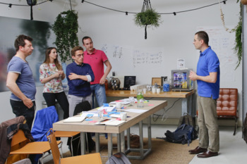
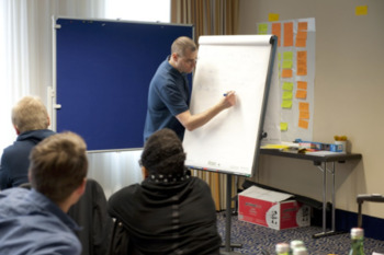
We had some of those metrics from Google Analytics, and they looked good, but we never really did a live test. I speak at at least one conference a month, sometimes four or five, and we thought that it shouldn’t be too hard to convince someone at each conference to participate in a test. Armed only with suspicion about the product management confusion problem, I found the first test subject who was a nice fit for our primary persona. I opened the web page, explained the first task, and sat back. Five minutes later, I felt as if someone had pulled my guts out and started twisting and squeezing them. My first instinct was to explain, point, blame, yell, but I kept quiet and took the gut pain. My test subject was not even able to find the button to create a new map, despite the fact that for me it was completely obvious where it was. I did four more tests that day, and only one person found that button quickly. Sure enough, five people are not enough for a statistically relevant test, but even if a single person cannot not find a way to start interacting with the system quickly, our users are not as productive as we wanted.
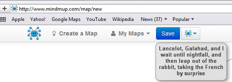
The old MindMup menu - Create a Map was there but people could not see it!
This test was a huge wake-up call. Painful as it was, it at least gave us a nice baseline to measure against, and some good ideas about what to tweak. For example, the “Create a Map” button was in the top left corner of the screen, but it took people in average about five to six minutes to discover it there. I wanted to scream out “Look, it’s there!” but it obviously wan’t for them. We thought it would be logical to have a “My Maps” menu and that people would go there to open an existing map, but our test subjects did not seem to understand that metaphor.
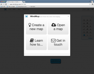
The new splash screen with the four most common starting actions.
In the two months that followed, we moved menus around, grouped things where people expected to see them, and ended with some solutions that now seem pretty obvious. We took the four typical things people want to do when they start, and built a welcome splash screen that new users see when they first visit the site. We made our menus look much closer to a typical desktop application, so people could navigate quickly and find things where they expected them. “My Maps” was gone, “File->Open” was there receiving clicks.
Quality was quantified. Repeating tests and iterating over the design, we got to the point where we had proof that new users feel quite productive when using it. Novice users were now able to complete all the main activities quickly and effectively, and we removed distractions to reduce friction. The desktop application metaphor seemed to be well understood, and further testing opened up some interesting insight. Asking test subjects to think out loud, I noticed that several of them were right clicking around the map - the interface that looked like a desktop application got people to expect right-click context actions. We put that in as a quick fix, unaware that this will cause probably the biggest boost to our traffic in months.
A week later MindMup was reviewed on LifeHacker, and one of the things the author liked the most was the fact that the right-click menu was there when he needed it: “These little touches make the app feel more native, and less like a typical web app.”
The spike after the LifeHacker review and the subsequent halo effect
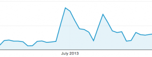
This review got syndicated to other LifeHacker sites, but also widely pirated and translated to lots of languages. Itself, it caused a massive spike in visits, but the halo effect was also significant and lasted for weeks. Many productivity bloggers picked up the tool and wrote about it. A month later there were thousands of new pages linking to MindMup, as reported by Google, coming from genuine as well as pirated blog posts. This contributed significantly to our Google page ranking, we got to the #2 spot for “free online mind map” and jumped into the first page for many other important search phrases. This translated to months of increased traffic, and still continues.
The lesson here is that, though we started building the product to scratch our itch, it was still wrong to assume that we could represent the users at large. We fell into the trap of confusing ourselves with our users, tricked by the comfort provided by automated analytics. Google Analytics didn’t really give us info on how many people failed to understand the menus, and that they wanted something that feels more as a native app than a web site. Because of the way we designed the system, there was no easy way to distinguish between someone just browsing, and someone who can’t find where to create a new map. In hindsight, perhaps we could have built more analytics to identify that, but live testing with users gave us a lot more valuable information. I’m incredibly thankful to everyone who participated in our tests, for no financial reward but only to help. The cost of the whole exercise was 0, and the benefits were enormous.
Here are some nice references for additional reading:
- Inspired: How To Create Products Customers Love by Marty Cagan
- The relevant excerpts from Cagan’s book are also republished on his company web site: The Role of Domain Experience, Personas for product management, and Prototype Testing
- The ACC matrix technique is described in How Google Tests Software